Porcelain tiles are a versatile and stylish choice for interior spaces. Whether you are designing a home, office, or commercial area, choosing the right porcelain tiles that complement your interior color scheme is essential for achieving a harmonious and aesthetically pleasing environment. As a leading porcelain tiles exporter, we understand the importance of selecting tiles that enhance the beauty of your space while maintaining durability and functionality. In this guide, we will explore how to match porcelain tiles with various color schemes to create stunning interiors.
Understanding Color Psychology in Interior Design
Before selecting porcelain tiles, it is essential to understand color psychology and its impact on a space. Colors influence mood, perception, and ambiance. Here’s how different colors work in interior design:
- Neutral Colors (white, beige, gray) create a clean, timeless look and work well with any decor.
- Warm Colors (red, orange, yellow) add energy and warmth, making spaces feel cozy.
- Cool Colors (blue, green, purple) evoke calmness and relaxation, perfect for bedrooms and bathrooms.
- Dark Shades add depth and luxury but should be balanced with lighter tones to avoid making the space look too heavy.
With this knowledge, selecting the right porcelain tiles to complement your interior becomes easier.
Matching Porcelain Tiles with Different Interior Color Schemes
Classic Monochrome Elegance
Monochrome interiors featuring black, white, and gray tones create a sophisticated and modern look. Porcelain tiles in shades of gray, white, or black add depth and contrast to a monochrome setting. A porcelain slab manufacturer may offer high-gloss or matte-finish slabs that enhance the sleek appeal of a monochromatic space.
Best Tile Choices:
- White polished porcelain tiles for a bright, airy feel.
- Charcoal or black porcelain slabs for a bold contrast.
- Gray veined porcelain slabs that mimic natural stone.
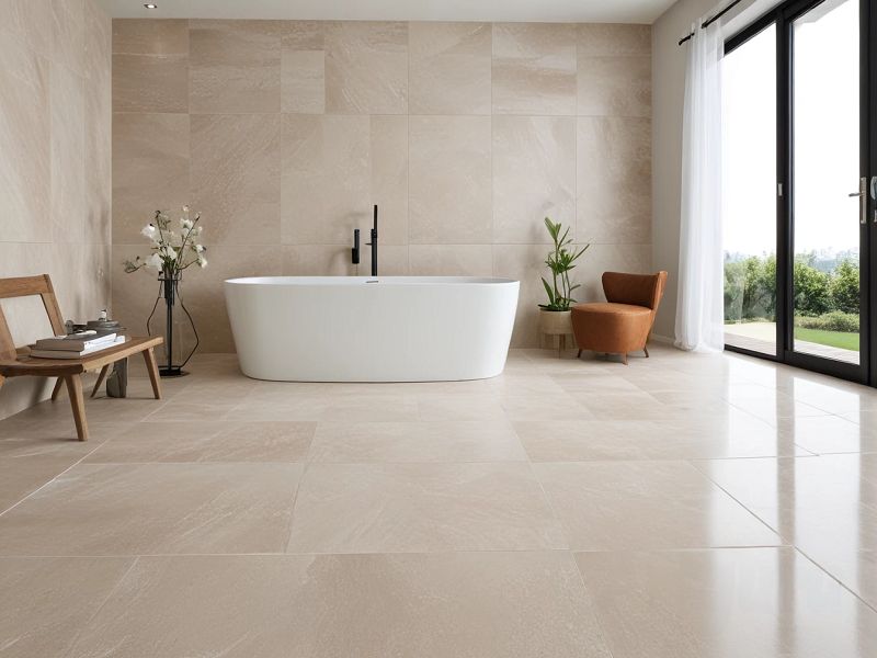
Neutral and Earthy Tones for a Warm Ambience
Neutral color schemes, including beige, taupe, and brown, create a warm and inviting atmosphere. Porcelain tiles in natural stone or wood-look finishes are ideal for this palette. As a top porcelain tiles supplier, we recommend tiles that emulate the beauty of natural materials while offering the durability of porcelain.
Best Tile Choices:
- Wood-look porcelain tiles for a rustic appeal.
- Sand-colored porcelain slabs for a natural stone effect.
- Taupe or cream tiles with subtle patterns to add texture.
Cool and Refreshing Blues and Greens
Blue and green color schemes evoke tranquility and freshness, making them perfect for bathrooms, bedrooms, and living spaces. When combined with porcelain tiles, these colors create a refreshing and relaxing environment.
Best Tile Choices:
- Light gray or white porcelain tiles to balance deep blue walls.
- Aqua or teal porcelain slabs for an accent wall or flooring.
- Marble-look porcelain tiles with subtle green veins for an elegant touch.
Bold and Vibrant Accents
If you love bold interiors with red, orange, or mustard yellow tones, choosing the right porcelain tiles is crucial to maintain balance. A porcelain slab exporter can provide a range of vibrant tiles that match your unique design preferences.
Best Tile Choices:
- Matte-finish neutral porcelain tiles to tone down vibrant colors.
- Patterned porcelain slabs that incorporate warm hues subtly.
- Terra-cotta-inspired porcelain tiles for a Mediterranean aesthetic.
Luxurious Dark-Themed Interiors
Dark and moody interiors, featuring deep shades of navy, emerald green, or charcoal, exude luxury and drama. A porcelain tiles manufacturer may offer high-gloss or textured porcelain slabs that enhance the sophistication of such spaces.
Best Tile Choices:
- Black marble-look porcelain slabs for a dramatic effect.
- Dark gray or metallic-finish porcelain tiles for added texture.
- Glossy black porcelain tiles to reflect light and prevent the space from looking too dark.
Choosing the Right Finish for Porcelain Tiles
Selecting the right finish is as important as the color when matching porcelain tiles with interiors.
- Glossy Finish: Best for modern, high-end interiors as they reflect light and make spaces appear larger.
- Matte Finish: Suitable for rustic, traditional, or earthy interiors, offering a non-slip surface.
- Textured Finish: Ideal for adding depth and interest, commonly used in accent walls or outdoor areas.
Final Tips for Perfect Tile and Color Coordination
- Consider Lighting: The appearance of porcelain tiles can change under different lighting conditions. Natural light enhances lighter tones, while artificial light can add warmth to darker tiles.
- Use Sample Tiles: Before making a final decision, test sample tiles against your wall colors and furniture.
- Maintain Balance: Avoid overwhelming a space with too many patterns or clashing colors. Opt for complementing shades.
- Think Long-Term: Choose timeless tile colors and designs that will remain stylish for years to come.
- Consult a Professional: A porcelain tiles supplier can provide expert advice on the best tile options for your interior design needs.
Conclusion
Matching porcelain tiles with your interior color scheme is a crucial step in achieving a cohesive and visually appealing space. Whether you prefer classic monochrome, warm neutrals, cool blues, bold accents, or luxurious dark themes, there are endless possibilities with high-quality porcelain tiles. As a trusted porcelain tiles exporter, we offer a vast selection of tiles and porcelain slabs that cater to diverse design needs.
By understanding color psychology, choosing the right finishes, and following expert tips, you can create stunning interiors that reflect your style and personality. Contact a reputable porcelain tiles manufacturer or porcelain slab exporter to explore premium-quality tiles that perfectly match your interior vision.