Brand: Legato Porcelano
Category: Bathroom Porcelain Tiles
Reading Time: ~8 Minutes
→ Part of the: Porcelain Tiles for Bathroom — Complete Guide › Small Bathroom Tile Ideas
Part of the Porcelain Tiles for Bathroom Pillar | Related: Large Format Bathroom Tiles | Matte vs Glossy Finish Guide
Introducation
A small bathroom is not a design problem. It is a design constraint — and constraints, applied with precision, produce some of the most resolved interiors in architecture. The bathrooms that feel genuinely expansive in 4 square metres are not the ones that ignored their size. They are the ones where every tile decision was made with spatial intelligence.
The rules that govern how tile affects spatial perception are not opinion. They are geometry, light physics, and visual psychology — and they are consistent across observers. Fewer grout lines expand perceived space. Higher light reflectance values amplify brightness. Vertical tile orientation elevates ceiling height. Tonal grout creates continuity. Each of these effects is measurable, reproducible, and achievable in any bathroom regardless of its physical dimensions.
This guide covers every tile strategy that expands small bathrooms — format selection, colour and LRV science, layout orientation, grout discipline, and the common mistakes that make small bathrooms read smaller than they actually are.
THE STRATEGIES — BEFORE YOU READ FURTHER
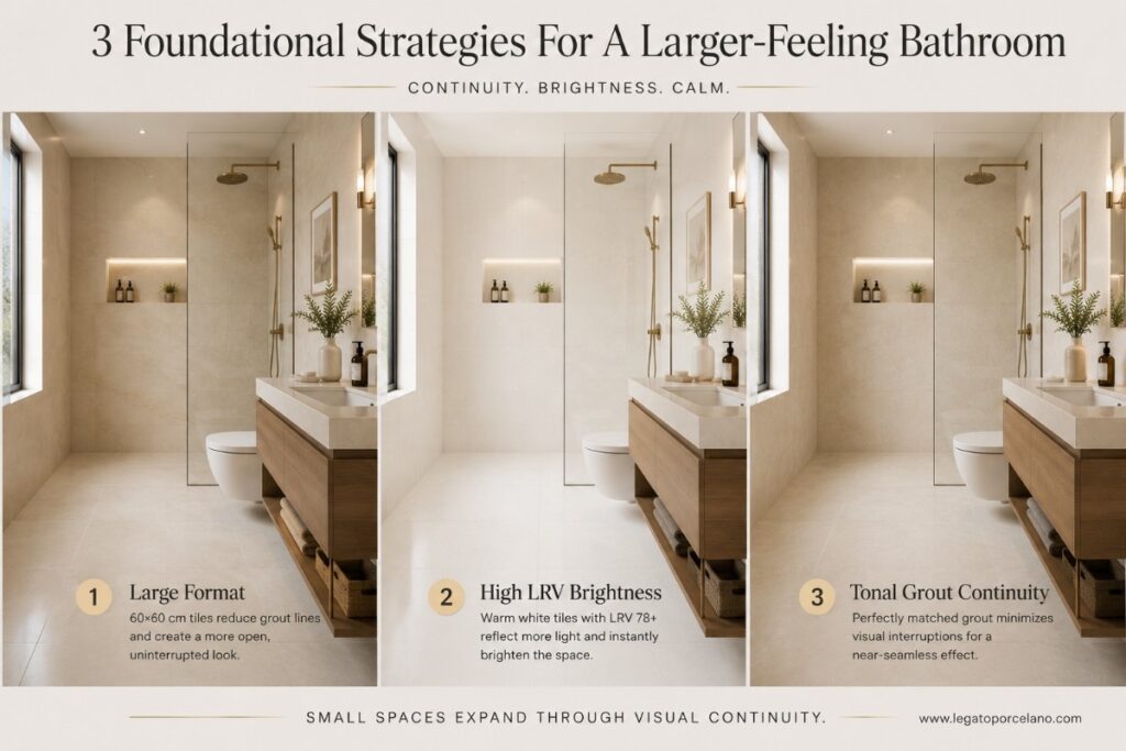
Large format tiles (60×60 cm+) in light tones (LRV 65+). Tonal grout matched to tile base colour. Vertical tile orientation on walls. Glossy or satin walls for light amplification. Floor-to-ceiling continuous tile. No high-contrast grout. No small mosaic tiles as the primary surface. One material, two or three surfaces maximum.
The Science of Spatial Perception in Small Bathrooms
Small bathrooms look small for specific, identifiable reasons — not simply because they are physically compact. Understanding the mechanism behind perceived size is the first step to overriding it with tile decisions.
Grout Lines as Spatial Boundaries
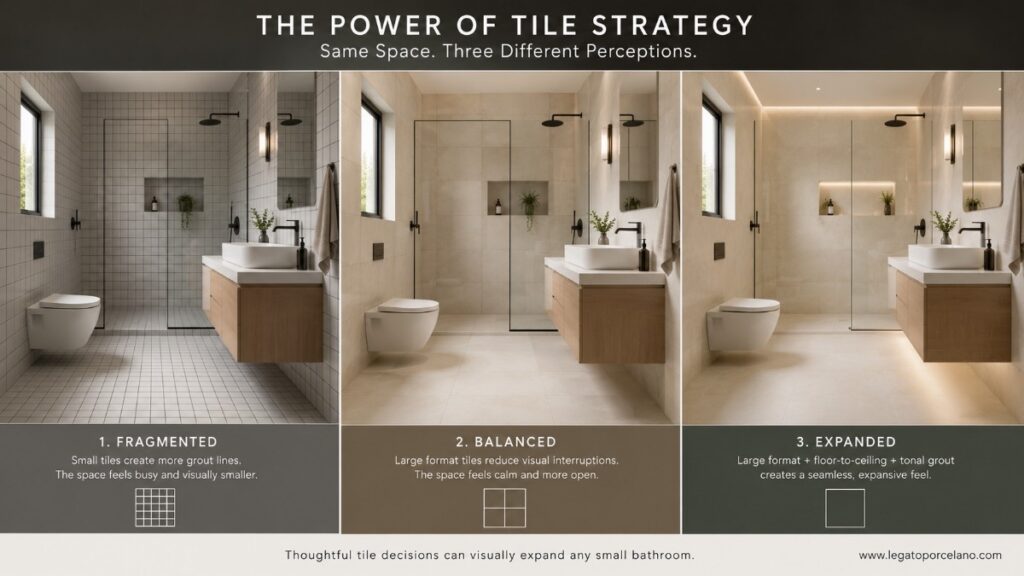
Every grout line is a registered boundary — a visual interruption the brain processes as a spatial limit. Per Edward Martin’s published tile research, grout joints act as visual dividers that segment the tiled surface into smaller units. In compact bathrooms, these interruptions make walls and floors feel busy and fragmented, actively reducing the sense of openness. Large format tiles reduce the number of joints per square metre, producing a smooth, continuous surface that reads as a single plane. Per the same analysis, this uninterrupted surface draws attention away from individual tile units and toward the overall design, making the room feel larger.
Light Reflectance Value (LRV) and Tile Colour
LRV — Light Reflectance Value — is the measurable percentage of visible light that a surface reflects, scored on a scale of 0 (perfect black) to 100 (perfect white). Per ASTM C609 and ISO 10545-18:2022, which define the test method for ceramic and porcelain tile LRV, bright white tile achieves approximately LRV 85; practical white in most tile collections sits at LRV 75–82. Per Edward Martin’s colour analysis, tiles with LRV 65+ reflect significantly more ambient light, making them ideal for bathrooms with limited natural light.
In a small bathroom, tile colour with LRV above 65 — warm whites, soft cream, light stone, pale grey — keeps the room luminous regardless of window size. Every point of LRV reflected from the tile surface is one less lumen you need from artificial lighting to maintain a bright, open-feeling space. This is not an aesthetic preference — it is light physics.
Continuity and the Eye’s Path
The eye naturally follows grout lines as pathways — in the same way it follows roads or corridors. A small bathroom tiled in a grid pattern of small tiles presents dozens of directional cues that the brain processes as boundaries. A small bathroom tiled in large format, with tonal grout, presents an almost uninterrupted surface — the eye moves across it freely, reading the room as continuous rather than divided.
“For bathrooms with limited square footage, large tiles can blur boundaries and reduce the sense of confinement — the fewer grout lines allow light, both natural and artificial, to move more evenly across surfaces.”
6 Tile Strategies That Visually Expand a Small Bathroom
These strategies are ordered by impact — from the single decision that produces the largest spatial return to the refinements that compound it.
| Strategy | How It Works | Best Applied To |
|---|---|---|
| Large Format Tile | Fewer grout lines = fewer visual boundaries = room reads as larger | Floors + walls, all small bathrooms |
| LRV 65+ Colour Selection | High-reflectance tile distributes ambient light uniformly across the room | All surfaces, especially low-light bathrooms |
| Tonal Grout | Grout matched to tile base colour eliminates grid contrast — surface reads as continuous | All tile installations, highest impact on floors |
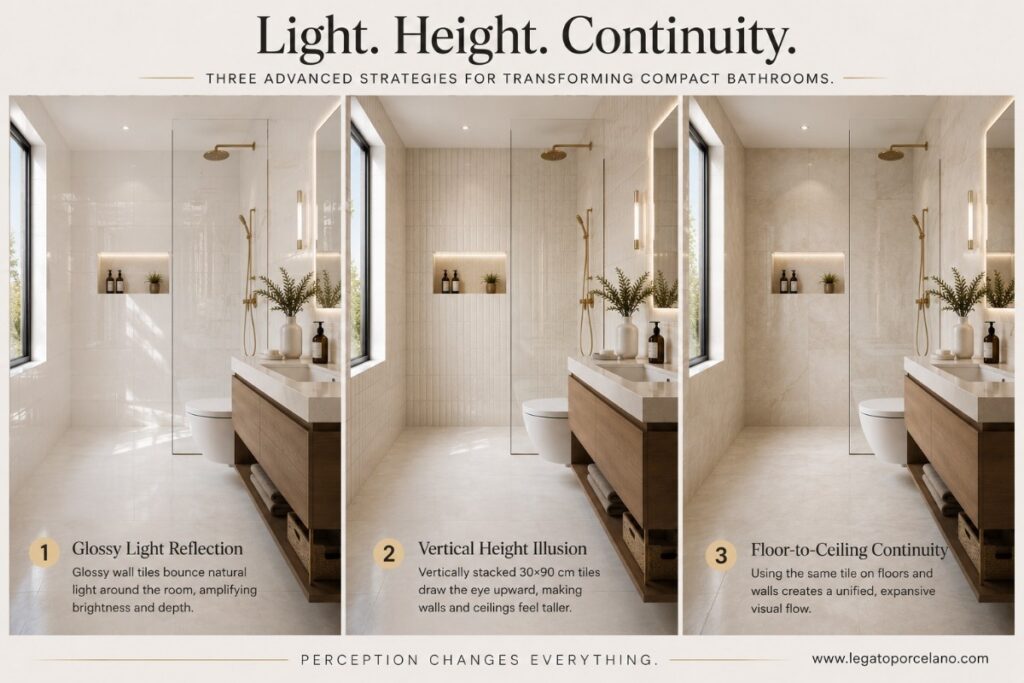
| Glossy Walls | Specular light reflection amplifies perceived brightness and depth on vertical surfaces | Walls and shower walls — dry and wet zones |
| Vertical Tile Orientation | Draws eye upward — ceiling reads as higher and more distant than it physically is | All wall tiles, especially shower walls |
| Floor-to-Ceiling Continuity | Same tile across floor, walls, and shower removes material transitions and visual breaks | Bathrooms ≥ 3.5 m² with good substrate prep |
Each Strategy Explained: How to Apply Them in Practice
Strategy 1: Large Format Tiles — The Highest-Impact Decision
The most effective way to make a bathroom feel larger is to use large-format marble-look tiles with minimal grout lines.
For bathrooms under 5 m², 60×60 cm or 60×120 cm tiles create a cleaner and more spacious visual effect. Fewer grout joints reduce visual interruption and help the surface read as continuous stone.
Large tiles also make maintenance easier because there are fewer grout lines to clean. This improves both practicality and aesthetics in daily use.
Using grout close to the tile colour further enhances visual continuity and creates a refined luxury appearance.
→ Deep dive: Large Format Bathroom Tiles — Complete Guide
Strategy 2: Tile Colour and LRV — The Light Physics Decision
Light-coloured marble-look tiles reflect more natural and artificial light, increasing perceived brightness throughout the bathroom.
Tiles with higher Light Reflectance Value (LRV) amplify ambient light and reduce visual heaviness, particularly in bathrooms with limited daylight. Soft whites, warm ivory tones, and subtle beige undertones create a more spacious and balanced atmosphere than darker surfaces.
Warm neutral palettes also soften the room visually, which is why they are frequently used in spa-inspired bathroom design.
Strategy 3: Tonal Grout — The Detail That Changes Everything
Grout occupies a surprisingly large percentage of the finished tile surface, especially in smaller bathrooms. Its colour therefore has a major influence on spatial perception.
Matching grout closely to the tile’s base tone minimises visual segmentation and creates a more seamless architectural appearance. In contrast, high-contrast grout introduces a visible grid pattern that can make compact bathrooms feel visually busier.
Luxury bathroom projects typically favour colour-matched grout because the surface reads as continuous material rather than multiple tiled sections.
Strategy 4: Glossy Walls — Light Amplification on Vertical Surfaces
Glossy marble-look wall tiles reflect both natural and artificial light, increasing visual brightness and enhancing the depth of the veining.
This effect works particularly well on vanity feature walls and shower surrounds where reflected light adds dimension and creates a more luxurious atmosphere. Polished finishes are often associated with hotel-style bathrooms because they amplify both lighting and material contrast.
For wet floor areas, however, matte or textured finishes remain the safer and more practical specification. Combining polished walls with matte floors creates a professional balance between visual drama and functional performance.
→ Related: Matte vs Glossy Porcelain Tiles — Complete Guide
Strategy 5: Vertical Tile Orientation — Engineering Height
Vertical tile layouts naturally guide the eye upward, making bathroom ceilings appear taller and more architectural.
Rectangular formats such as 30×60 cm, 60×120 cm, and slab-style porcelain panels become visually stronger when installed vertically rather than horizontally. This approach improves perceived proportions without requiring structural modification.
The effect becomes even stronger when grout joints are precisely aligned and the veining pattern flows continuously across the surface.effective in shower enclosures and narrow bathrooms where height is the dominant spatial constraint.
Strategy 6: Floor-to-Ceiling Continuity — Remove All Material Transitions
Using the same marble-look surface across floors and walls creates seamless visual continuity throughout the bathroom.
Eliminating abrupt material changes reduces visual interruption and allows the room to feel calmer, larger, and more refined. Large-format rectified porcelain paired with minimal grout joints produces the strongest monolithic effect.
This specification approach is widely used in luxury spa bathrooms and hospitality interiors because it creates an immersive architectural atmosphere without excessive decorative elements.
→ Related: Spa-Inspired Bathroom Design Guide
The 4 Tile Mistakes That Make Small Bathrooms Read Smaller
Each of these errors is among the most frequently documented in professional bathroom design guides — and each is avoidable with a single decision change.
Small Tiles as the Primary Surface:
Using 10×10 cm, 15×15 cm, or small mosaic tiles as the primary wall or floor tile in a compact bathroom multiplies grout lines and visual boundaries. Per Vitra Tiles’ design analysis, small tiles in small spaces is among the four most common mistakes that make bathrooms read smaller. Reserve small-format tiles for functional roles: shower floor traction, niche detailing, and accent areas only.
High-Contrast Grout:
Dark grout between light tiles — or any grout with strong visual contrast to the tile — reintroduces the grid that large-format tile is specified to eliminate. Per Great Britain Tile’s small bathroom guide, high-contrast grout breaks visual flow and is among the most consistently documented small-bathroom specification errors. Match grout to tile tone. Always.
Multiple Competing Tile Types:
Using three or more different tile formats, colours, or patterns in one small bathroom creates visual noise that emphasises the room’s boundaries rather than dissolving them. Per Great Britain Tile, the maximum for a small bathroom is two to three complementary tile choices. One primary surface tile, one accent application (shower niche, feature zone), one grout colour. Restraint is the design strategy.
Stopping Wall Tiles Below Ceiling Height:
Ending wall tiles at 1.8 or 2.0 metres in a standard-height bathroom creates a horizontal line that makes the ceiling feel lower and the room feel more compressed. Floor-to-ceiling tile, or tile taken to the ceiling with a slim border detail, removes this artificial ceiling reference and allows the vertical space to read fully. Per Great Britain Tile, terminating tiles at fixture height creates unnecessary horizontal lines that reduce perceived ceiling height.
Conclusion:
A small bathroom is not limited by its square metres. It is shaped by the decisions made about tile format, colour, grout, and orientation — decisions that the eye processes as spatial information before the brain consciously registers the room’s dimensions.
Large format, high LRV, tonal grout, glossy walls, vertical orientation, continuous surface. These are not design preferences — they are the mechanisms through which tile transforms perceived space. Applied together, they produce bathrooms that feel generous, resolved, and architectural at any physical size.
The cluster articles linked throughout this guide and in the map above go deep on each specific dimension — format-by-room selection, colour and LRV strategy, vertical tile, shower specifications, white bathroom design, and grout colour discipline. The overview is here. The precision is one click away.
“Small bathrooms do not need more space. They need better decisions about the space they already have.”
| 🏛 | EXPLORE LEGATO PORCELANO Light-tone, large-format, and LRV-optimised porcelain tile collections — designed for bathrooms where every square centimetre of space counts. legatoporcelano.com/blog/ |
↑ Porcelain Tiles for Bathroom — Complete Pillar Guide | ↑ Large Format Bathroom Tiles Guide | Explore all Legato Porcelano collections
FAQs — Small Bathroom Tile Ideas Guide
Large-format tiles such as 60×60 cm reduce grout lines and create a more continuous surface. As a result, small bathrooms feel wider and less visually cluttered.
Absolutely. Continuous floor-to-ceiling tile applications remove visual breaks and create a more expansive effect. Many designers use Legato Porcelano large-format collections for this seamless spa-inspired look.
Glossy wall tiles help amplify light and depth, while matte floor tiles provide better slip resistance. Combining both finishes creates a balanced and practical design.
Yes. Tonal grout blends with the tile colour and reduces visible grid lines. This creates a cleaner, more seamless appearance in compact spaces.
Yes. Light-tone tiles with higher LRV reflect more natural and artificial light, making compact bathrooms feel brighter and more open.
Large-format porcelain collections from Legato Porcelano are designed to maximise visual continuity with minimal grout interruption and refined architectural finishes.
